Back to all projects

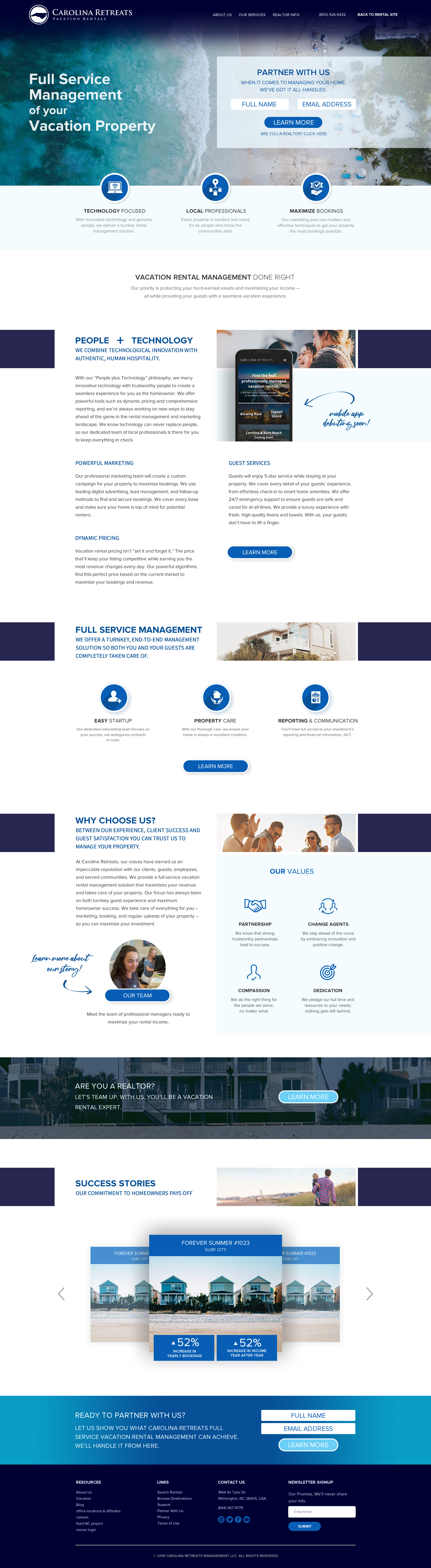
The client, a vacation rental and management company, had begun to expand their business into more key locations along the east coast. To attract more business on the management side, the client approached us with the project of creating a microsite to attract vacation rental homeowners. Their previous website had a single page dedicated to owners, and the client expressed a desire to have a microsite which would be able to elaborate on the strengths of their management services which could function separately from the rental site. This included creating new copy, graphics, and a website, which all needed to feel like its own distinct portal of information without straying too far from the already established branding of the rental website.
Before beginning the design process, I audited competitor websites, industry trends, and common features of similar industry microsites. During this process I took notes on ideas I had in regard to design, how to best position the brand within the industry, and what other brands were successfully implementing in their creative. I gathered research on what the company was looking for in function and form in regard to the microsite, as well as how certain aspects of their initial branding could cross over and be incorporated into the microsite. With this information I was able to start working with my team on forging a path for the project.
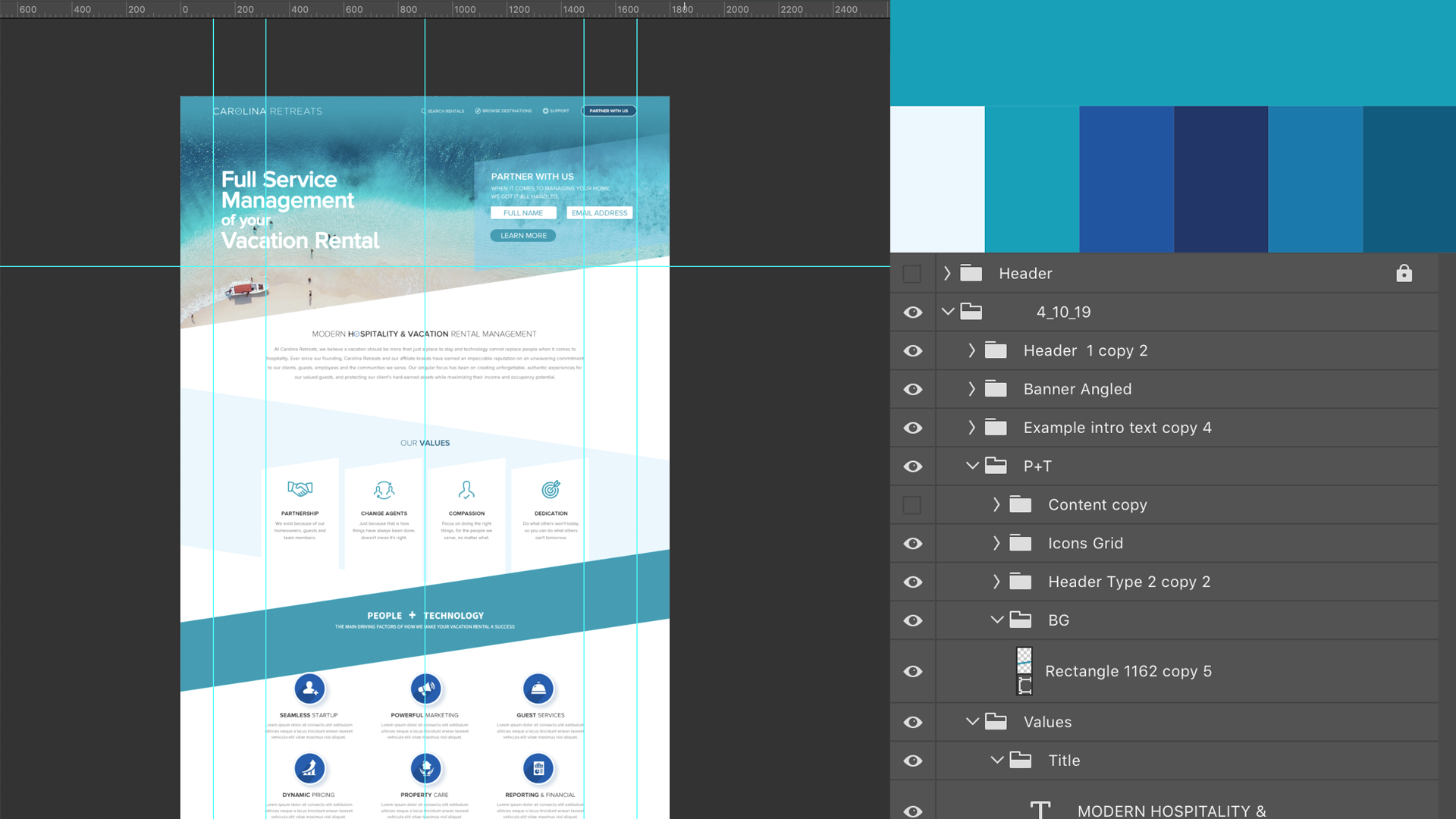
While in the middle of research, I was able to start playing around with some of the brand elements in Photoshop. I got a feel for how I wanted to display certain infographics and copy. I relayed to my team these ideas so they were able to assist on the copy side of things while I focused primarily on design. The design that I was crafting is what would later come to inform my team members how the copy would need to be structured, so constant communication with them was key in making this project successful. As one of the first projects where is was not only lead designer but also project lead, my team was where I found strength in motivating me to craft effective and communicative design.
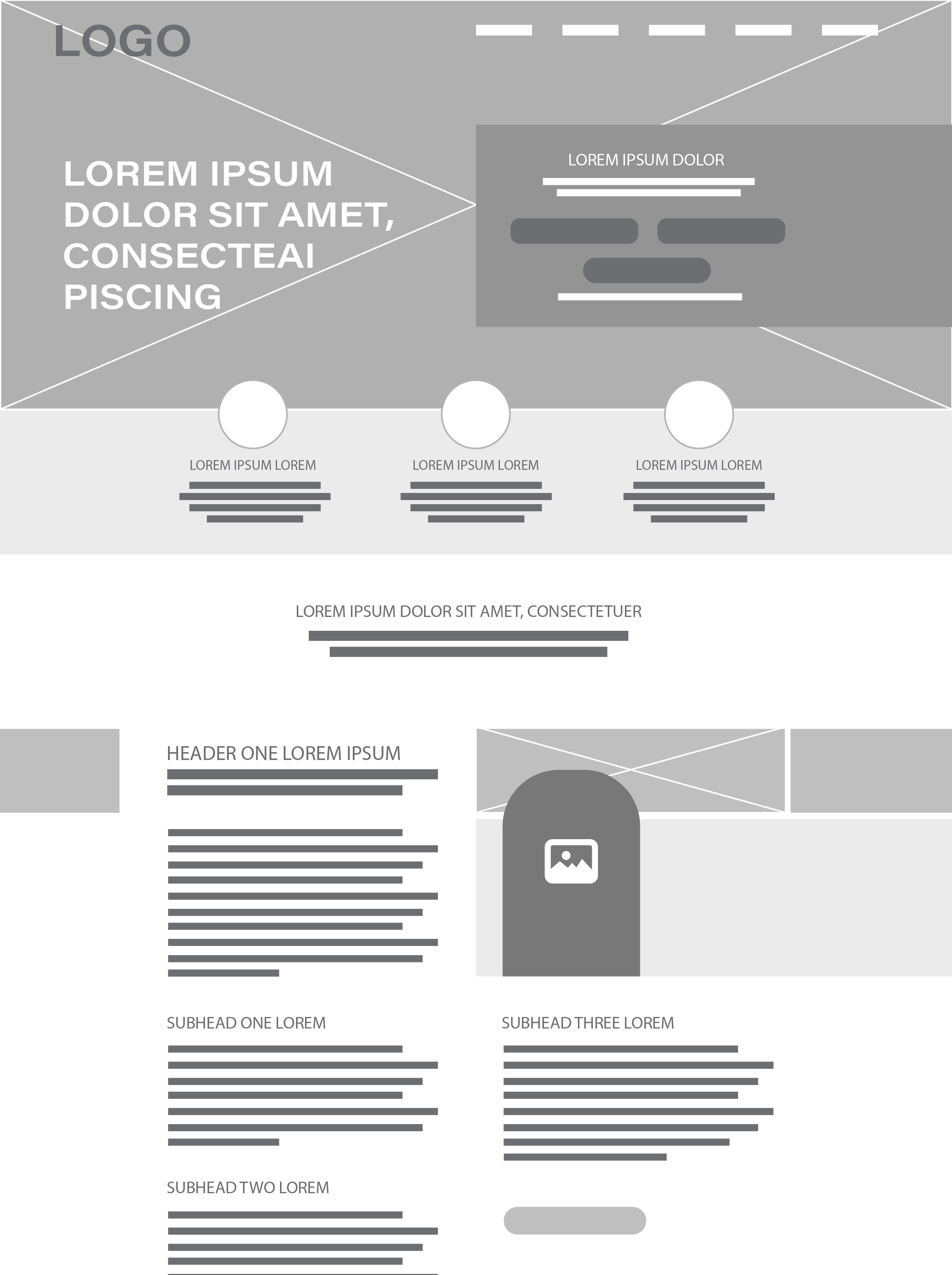
After I got a good feel for a starting point, I first began with creating wireframe layout drafts in a sketchbook. I started with a more "creative and contemporary" approach before choosing which of these more progressive website elements would remain and which would not fit with the translated branding. During the initial team discussions and the wireframing process, I began polishing a site map which would be the biggest asset for me in hitting all the bases needed to keep the site practical and navigable for it's users. This was also when the team began working on the copy, making the layout and copy a cohesive loop informing the design's direction.
Throughout this project there had been a lot of back and forth communication with the client, as well as internally, on refining our direction. As I built the website in Photoshop, my job was to make my design polished; all design aspects needed to be pixel-perfect and to scale, including clear labels of the layers and assets for easy hand-off to the web developer who would be building the live site. There was a lot of fine tuning in call-to-action copy and infographics during this time. I would work with my team's copywriter to refine wording and word count so it would appease the design without sacrificing message. I would also work with the client and account executive to ensure that the most important sections of the site were being called out effectively by the design.


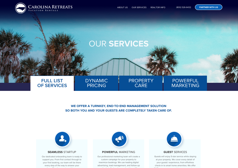
One of the biggest challenges to making a microsite is having the information be condensed and quickly navigable without creating a labyrinth of subpages. Carolina Retreats had a lot of information they wanted to highlight for potential partners and organizing that information in microsite format was the biggest focus in my design. The solution I came up with was to create a single page with tabs to feature the full list of services, as well as 3 tabs which go more in depth about the most marketable services offered. By implementing these tabs, users would be able to view these features all on a single page, reducing the web of subpages, and creating an area of concentration for information.