Back to all projects
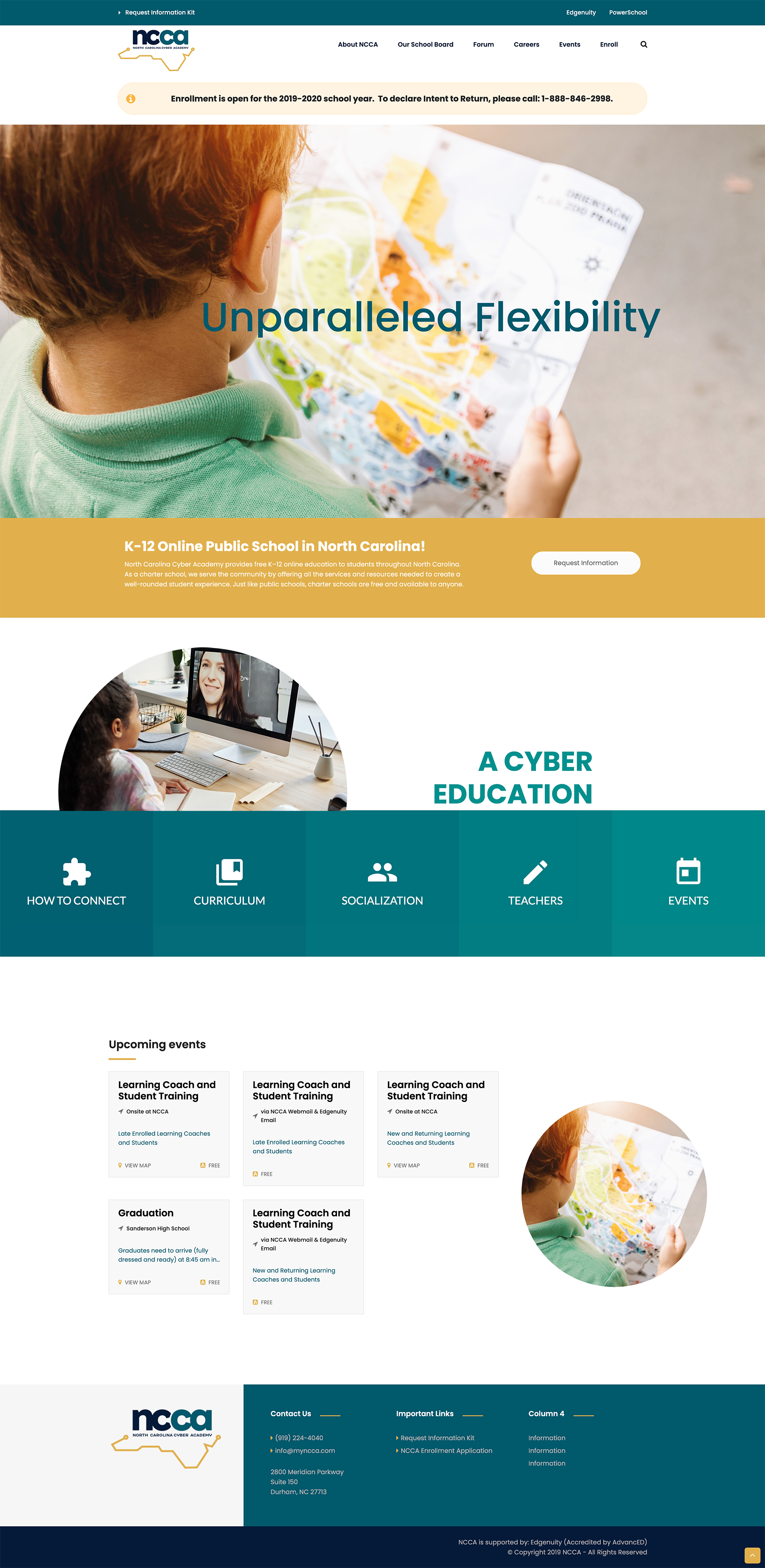
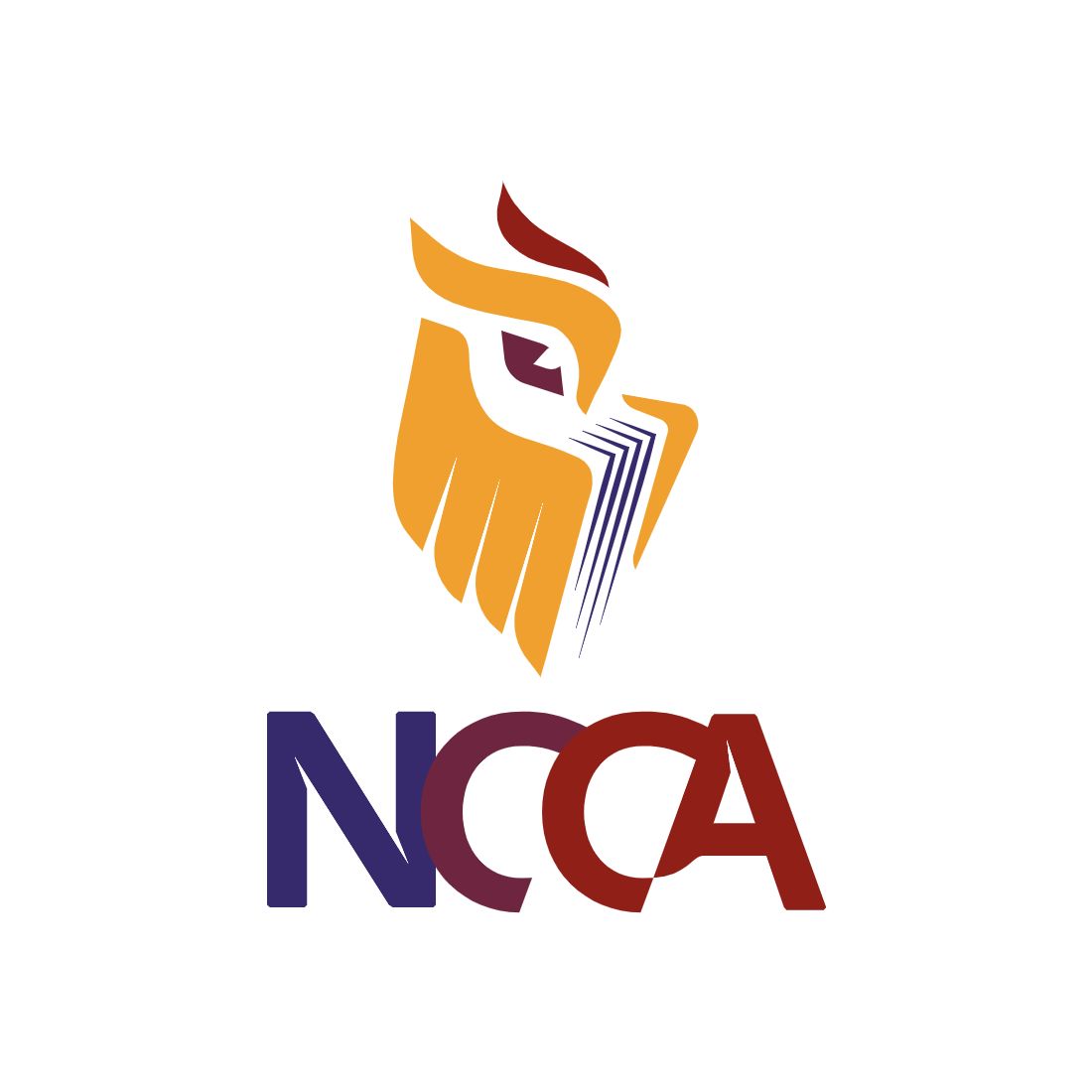
The client was rebranding after parting ways with their previous education network. As one of the only two online charter schools available in North Carolina, it was important to create a brand that was distinctive both from its competitor and its previous branding. The school caters to K-12 students, their parents, their board of directors, and state education leaders. It was important for the client to have a brand that was engaging for varying ages of children–from kindergartners to high schoolers–as well as parents and faculty. Fun, engaging, but with an air of sophistication and legacy–that was the client's leading hope for the new brand. Over the course of the rebranding, we delivered a new logo, brand package, and website.


Before beginning the design process, I researched competitor logos, industry trends, and a basic SWOT analysis of both the company and the previous brand design. During this process I took notes on ideas I had in regard to design, how to best position the brand within the industry and against its main competitor, and what other industry brands were successfully implementing in their creative. By identifying areas of strength and weakness I was able to make the logo part of the brand's strength in industry positioning.
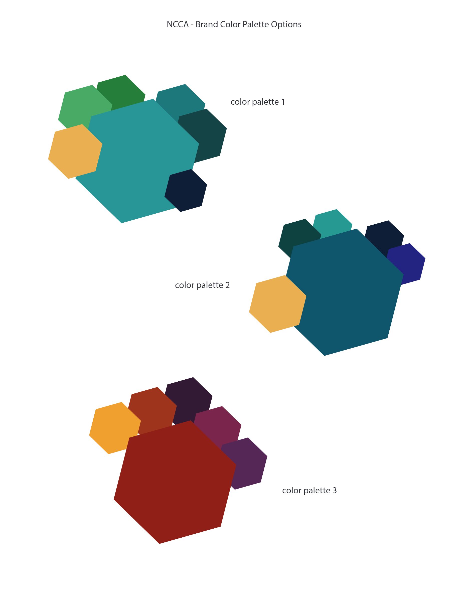
For NCCA's brand research, we invited a handful of parents, students, faculty, staff, and board members to participate in a focus group where we discussed their view of the brand and its future potential. Through this process we gathered a lot of useful information regarding color preferences, what did and did not work about the old branding, and how kids saw their school in different colors, shapes and animals. The insight from such a varied audience was valuable in helping me create a brand that worked for all of NCCA's audiences.
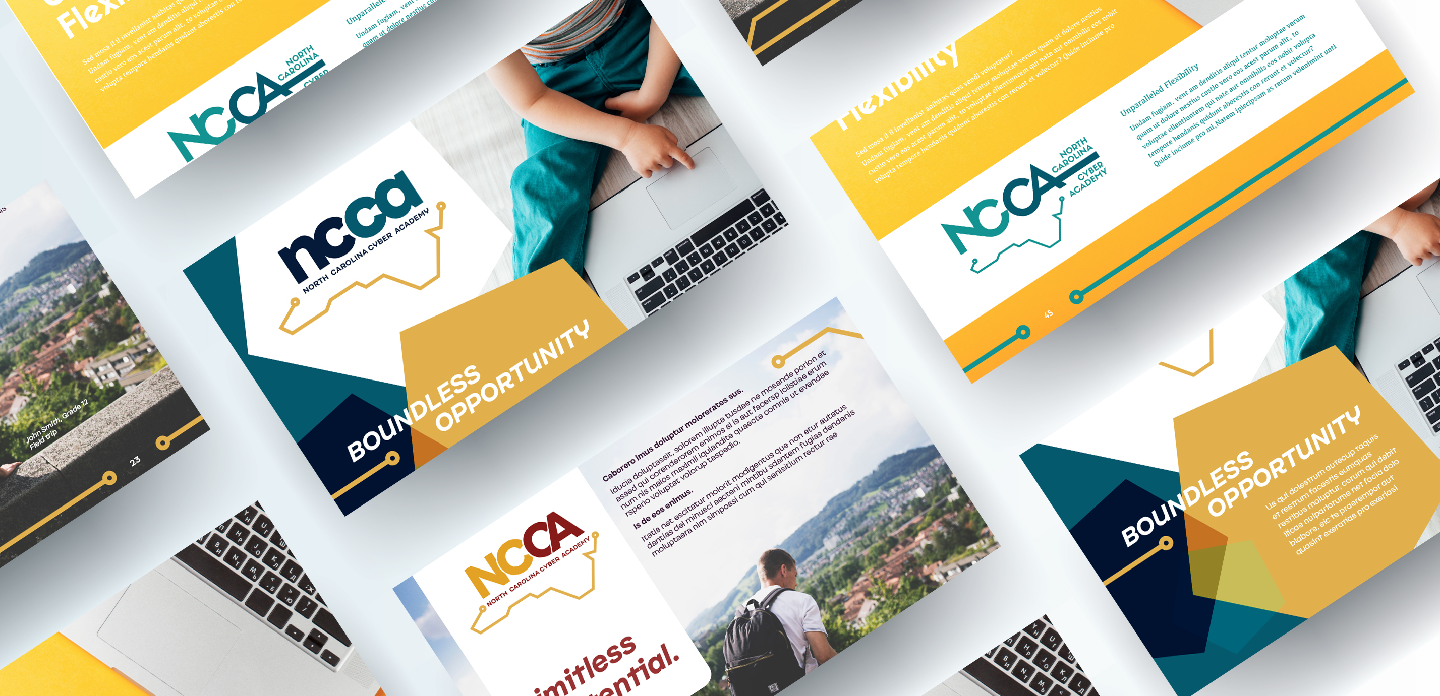
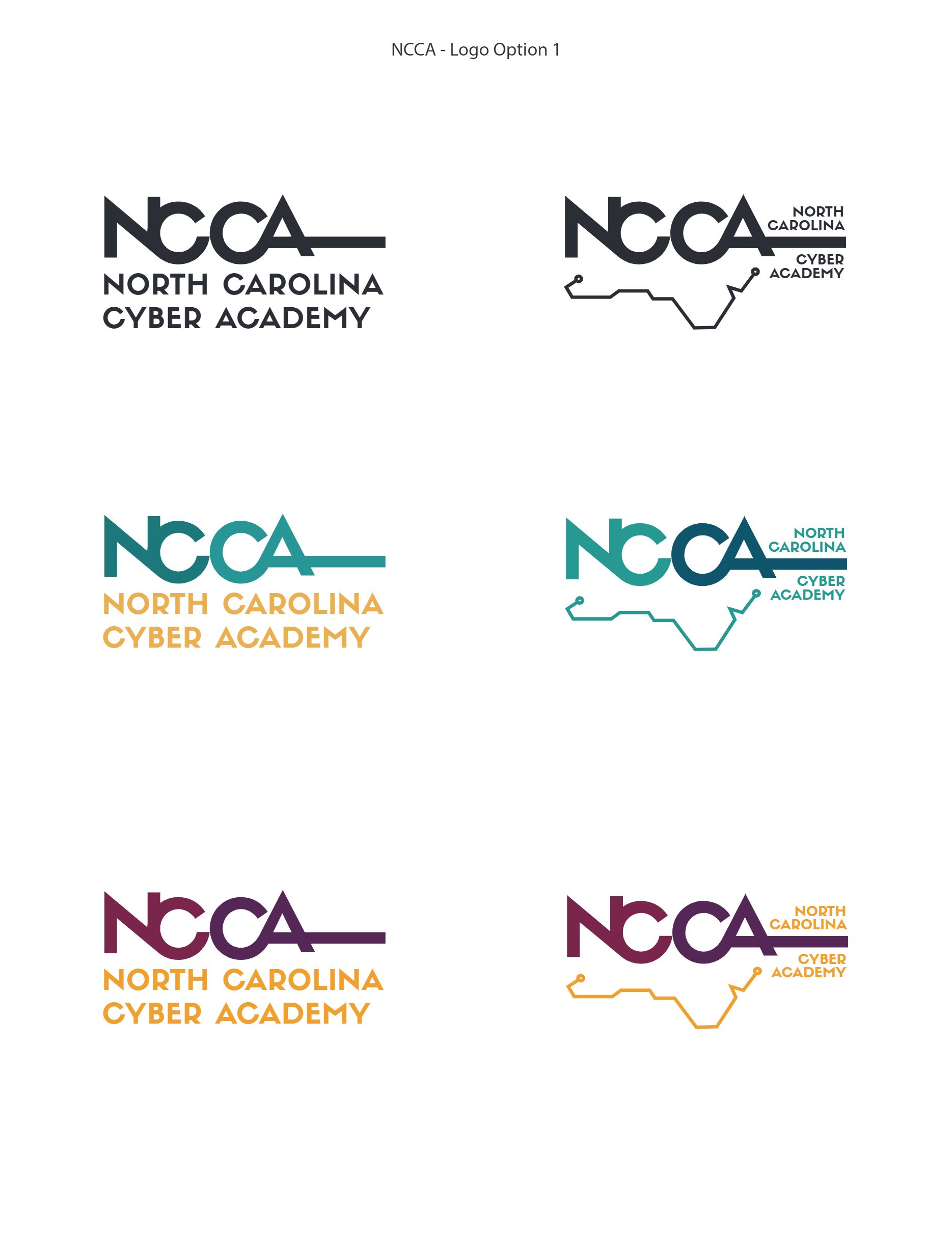
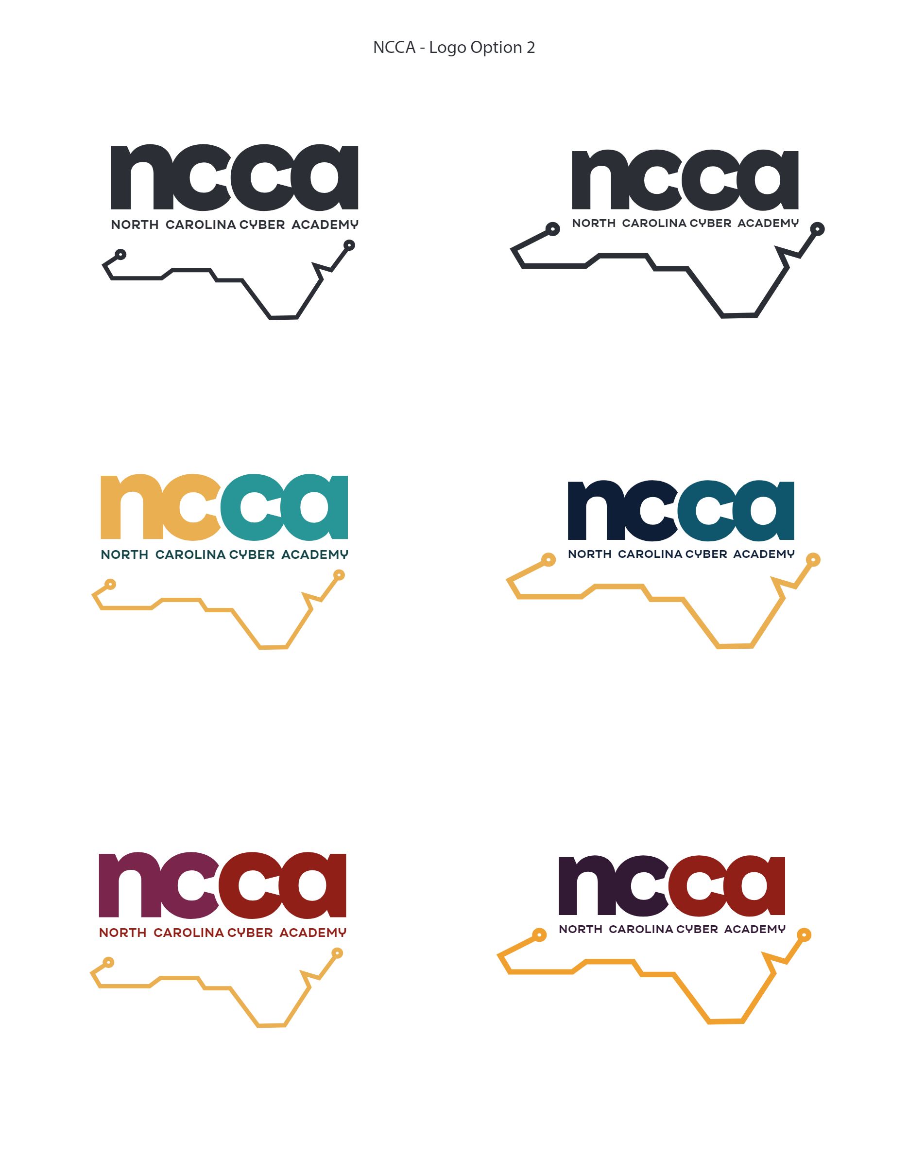
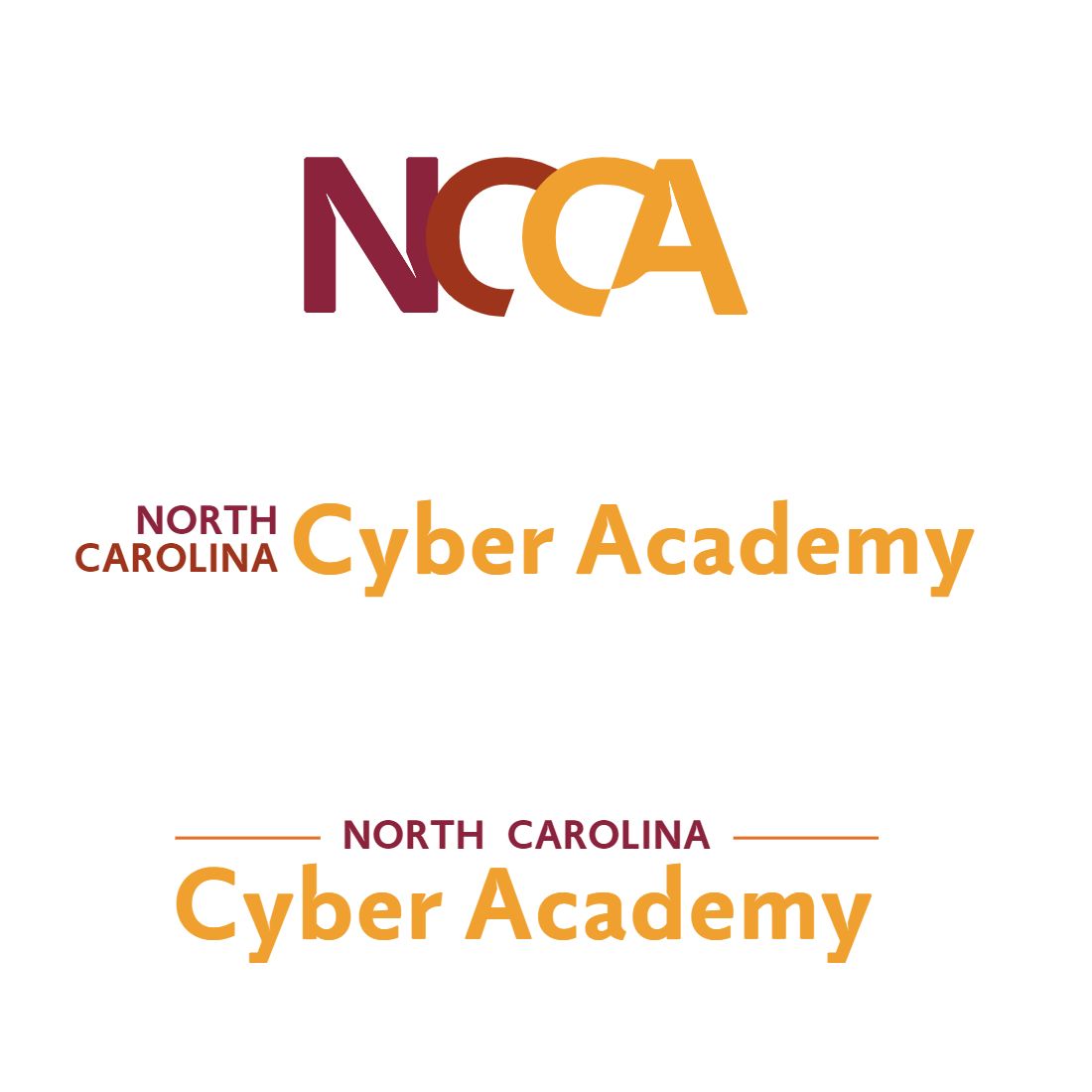
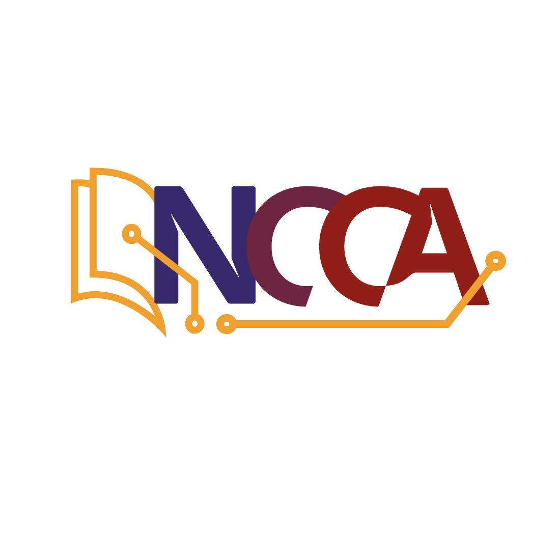
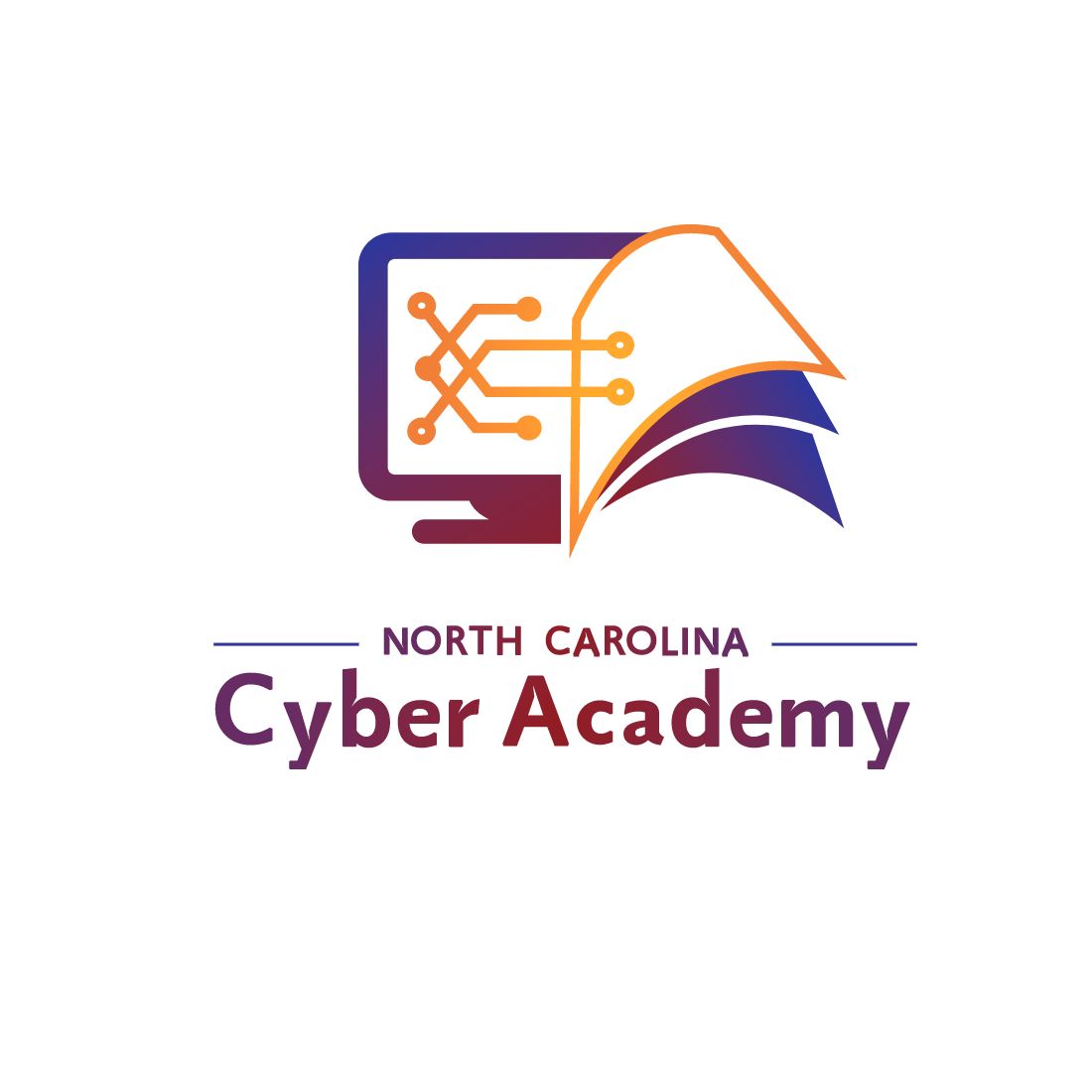
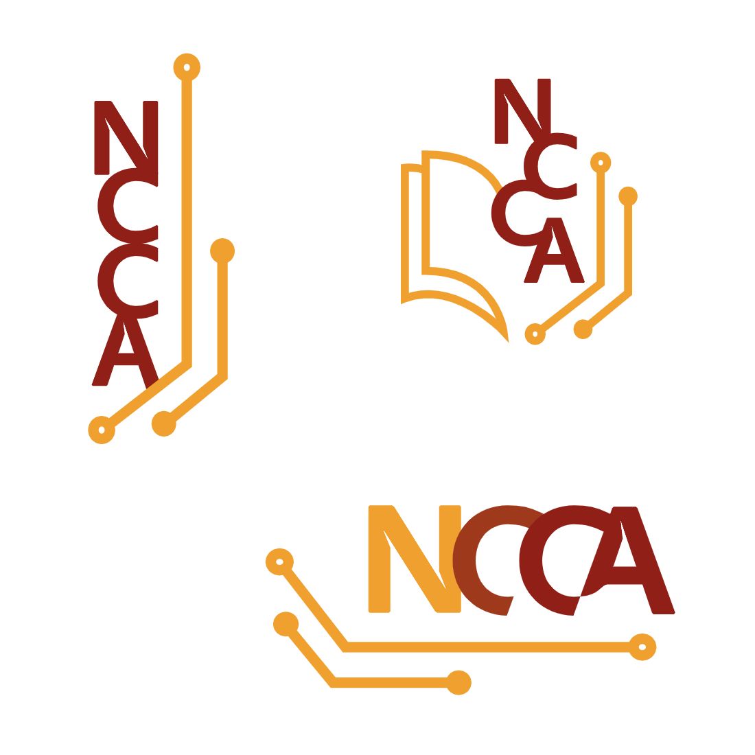
The drafting process took longer for this brand than most since we had such a large and varied amount of focus group feedback. Narrowing down the feedback and also using my initial industry research, I concentrated mainly on three different logo aspects: typeface, color, and a recognizable elements. While we had discussed the idea of creating a mascot logo or a crest logo, and I had drafted a few logos surrounding these ideas, they were ultimately put aside in favor of waiting to design them once the brand had developed a bit more.
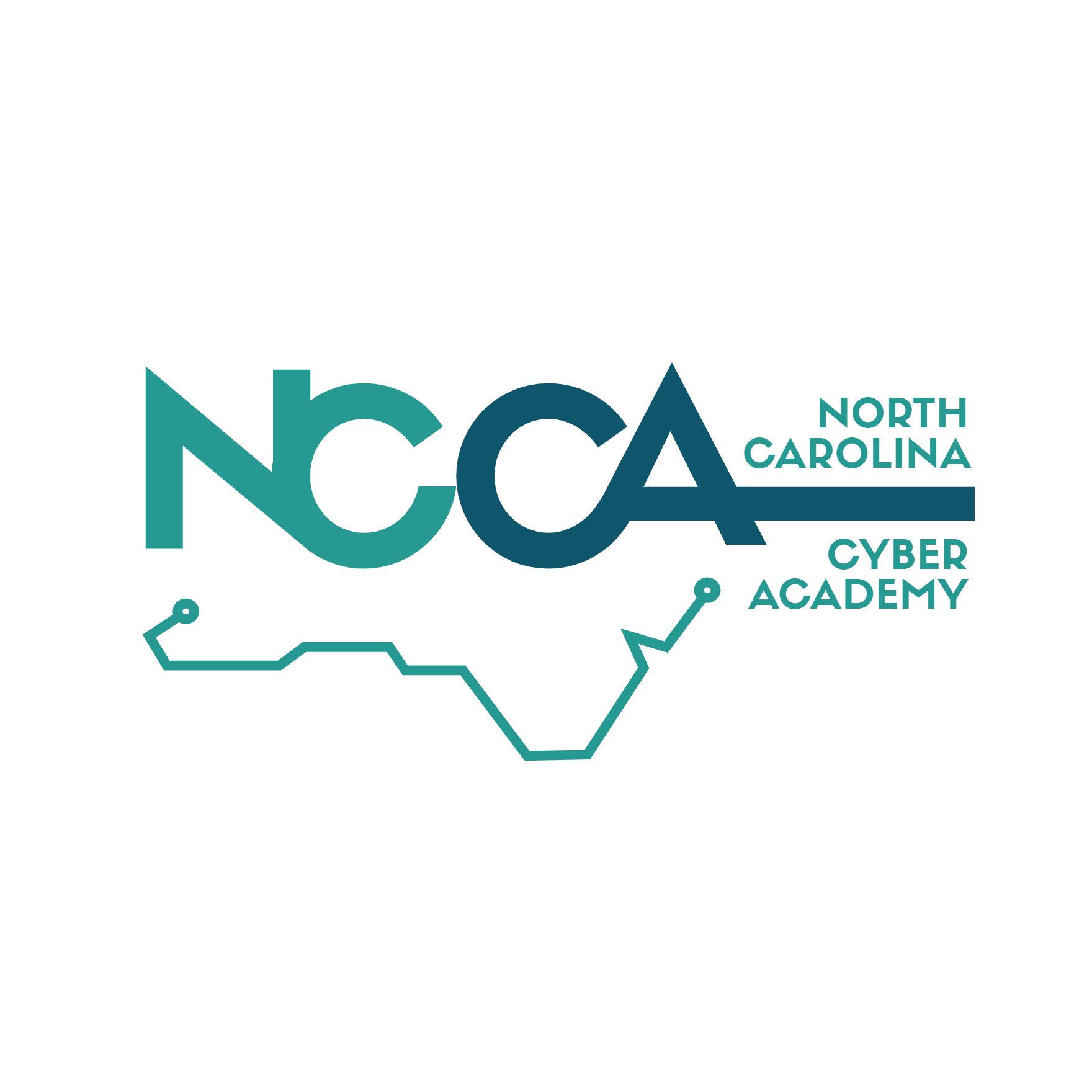
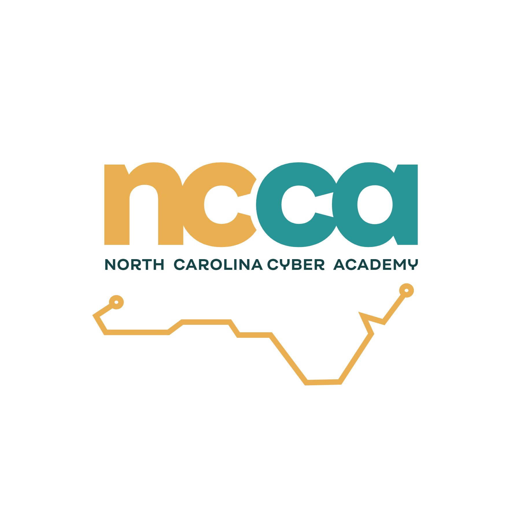
A unique aspect of working with this client was the process that had to happen in order to get designs approved. While this was not my first time having a board of directors involved in my design approval, it was the first time the board was involved in more than just a yes or no (with short edits). We went through a dozen rounds of edits and the variations in color were the most difficult thing to nail down, but in the end we made it work with everyone's consideration in mind. Working with large groups of feedback can be difficult, however, this was a fantastic learning experience for me in understanding how to communicate design to a wide variety of people in order to achieve a collective decision.
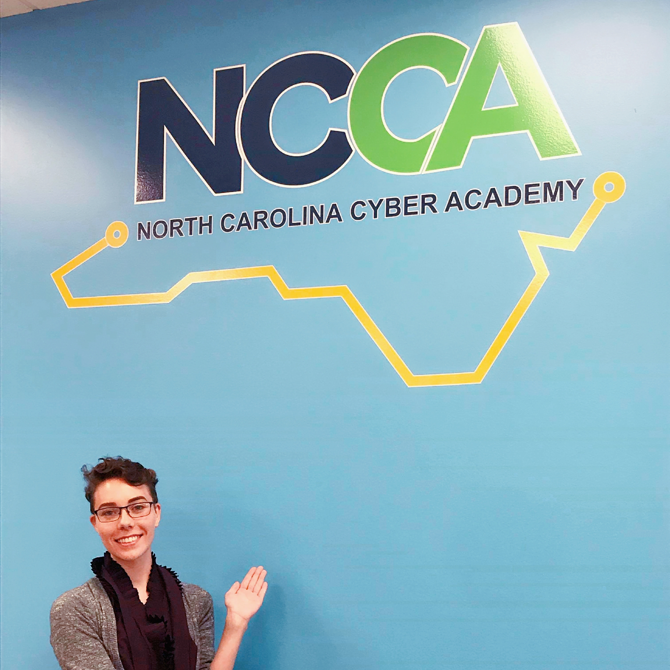
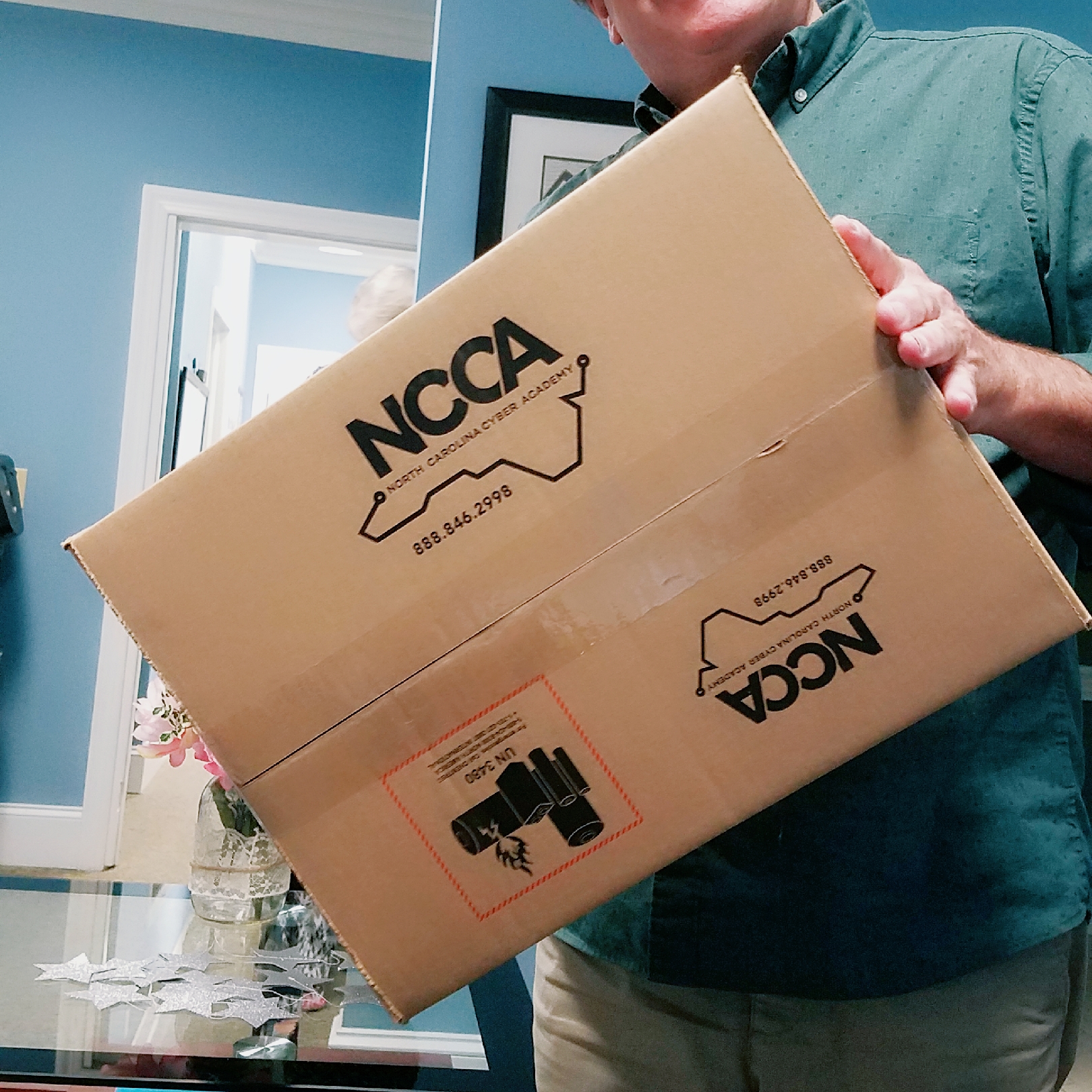
On walls and on boxes! I don't think I've ever seen my logo designs so large up close...